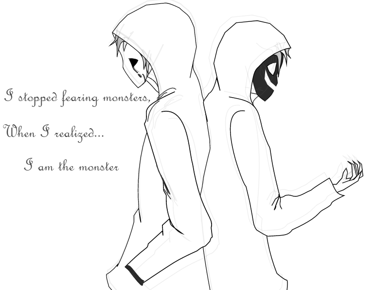
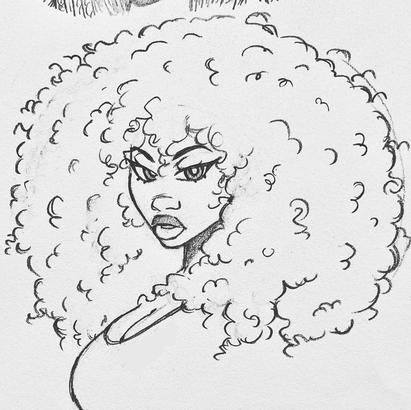
Answers from students- Why we need Art
- We need art to distract us from reality.
- It may be a way to cope with life and give you an interest and hobby. In my opinion, we need all different types of art in the world as a hobby and for people as a way to take a small break from life.
- Art can be relaxing and a way to express ourselves.
- It helps us experience the world around us at a deeper level and also understand those around us at a deeper level through their self-expression in art.
- I think art is an easier way to express feelings. Some people can't express how they are feeling in words, but they can express how they are feeling through art.
- We need art because it sparks joy and imagination in our minds and helps us to see the world in another way.
- Art can spark determination and other parts of our brain that we hadn't used before.
- I think we definitely need art, life gets boring and sometimes even frustrating without something to kick back and relax with. Not only that, but art is also used for people to express their emotions, things would be a whole lot more bland without people getting out their creativity!
- We need art to share lots of things -- how we feel, our personalities, and the things we like. Art is very versatile and defines beauty in many different ways. But the most important purpose of art is to tell a story.
- Art is important because for many people it is a method of escapism and it also helps us note history through paintings or other medium.
- Art is required whether we know it or not. Even something simple like a children's book has drawings and art inside. Music is a part of our everyday lives and is powerful and enjoyable. Without art, life would be pretty dull.
- I think we need art in the world as a way to express ourselves, and as an outlet. Painting is so peaceful and I love to just paint while I listen to music, I'm not really sure what I would do if I wasn't able to paint.
- Earth would be plain if we didn't have art.
- Earth without art is just eh... haha jk jk! We need art in the world because for someone in the world, it's their safe haven, or it calms them down, or it's the only way they can express themselves. Art can be pretty fun too, like playing with sidewalk chalk. I have so many great memories drawing with sidewalk chalk with my friends.
- We need art in the world because it helps express ourselves in ways we sometimes cannot explain, and it can bring us peace. If we did not have art in the world people would be more stressed, frustrated, or sad because they'd find it hard to be understood, and nothing would really bring them peace.
- Makes life more imaginable. I heard before art reminds us that we are not alone.
- We need Art to show how much we can all be alike and be different. It's also always a great activity and mind calmer. We always have it around us, like in school if a class does well, the most commonly as a prize or reward is drawing, coloring or watching a movie. It bring people together to have fun, socialize, and bring creativity into their minds.
- I think we need art in the world. It gives everyone a sense of imagination that they didn't know they could have, or see. Without art in the world, I think the world would be boring. Art brings life to those around them, shows different colors, shading, etc.
- We need art because without art you wouldn't have most things. Like spaghetti or cake because cooking and baking are art forms.
- I believe art is needed because its very amusing and special to see.
- I think we all need art because it gives our minds a bigger picture. I would have never been able to see different lines to draw art if it wasn't for Ms. McKnight.
- We need art because without it we can't be inspired to make something.
- The world needs art since it gives artists a way to explain things without words and it gives the people viewing the art something to relate to.
- We need art to express ourselves. No one thinks the same, and with art, we can sort of express our feelings more in a unique way.
- Art not only offers insight on broader cultural issues but also improves the quality of life. Even though more practical objects and locations aren't typically thought of as "art," they do add to the aesthetic experience. I believe that art enables you to view things in a unique way from other perspectives. Flow with your imagination.
- I think we need art because art makes people mentally healthier and happier.
Art Show Projects
Antonio A.
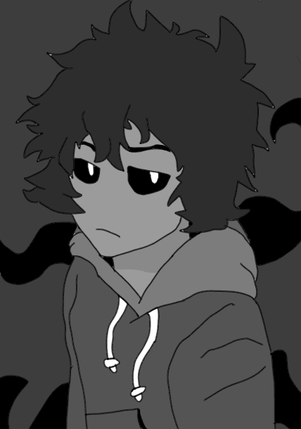
This is my main character for my upcoming project called ExperimentedVerse. His name is Anthony. I drew him because I am heavily invested in ExperimentedVerse which will be my greatest work of art. I used the app called Ibis Paint to draw him.
|
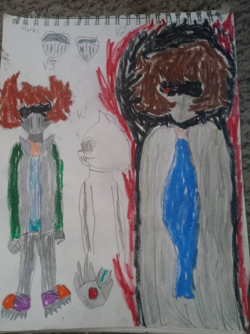
This is a character sheet of designs for a version of Anthony that is a vigilante. I made this drawing for an art assignment and because he looked cool. I used color pencils, a normal pencil, and oil pastels to draw him.
|
This is a cryptid made out of the combination of a rat, bear, and bird. I made it for an art assignment. I used a pencil, some string, and glue to make it. It has the intelligence of a rat, the strength of a bear, and the ability to fly.
|
Roxanna A.
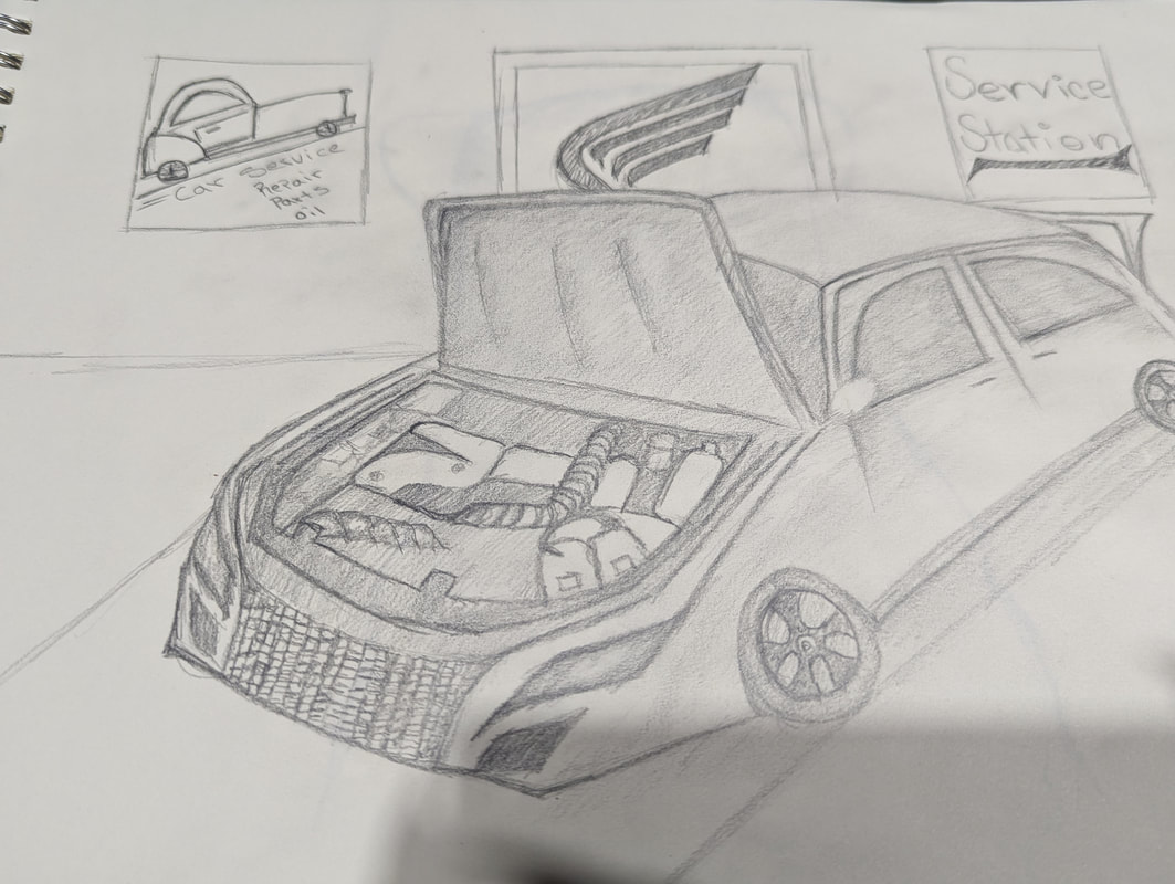
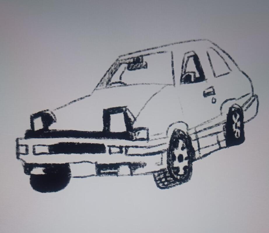
I always have been amused by cars, finding all the parts of an engine fascinating. I created this as a way to express my fondness to cars.
|
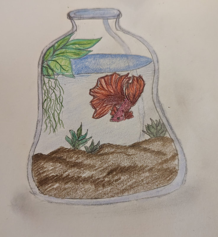
Nature is another thing I am really fond of, this piece is exhibiting the thought of climate change. As the fish is trapped in a bottle where it's safe and outside of the bottle is the emptiness of the disaster happening in the oceans.
|

The butterfly is a representation of "flying free" or "being free".
|
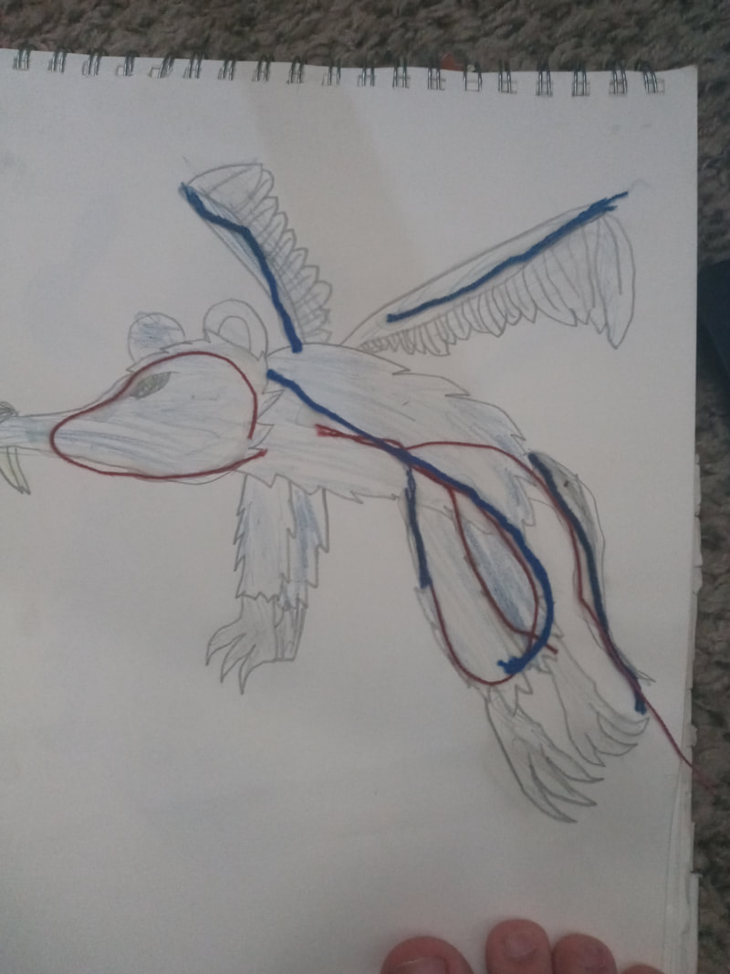
Seth A.

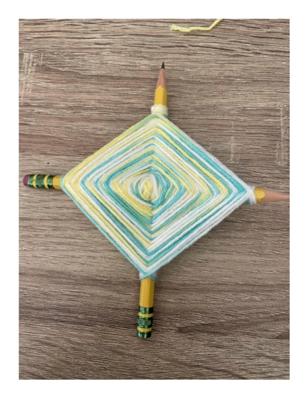
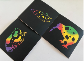
I was inspired to make a hybrid animal symbol that would combine 3 animals including a duck, hawk, and lion. I mixed different attributes of each animal and made it into my own creative shape and form. My symbol represents braveness, kindness, and determination. The lion represents braveness, the duck means kindness, and the hawk represents determination. I chose by creating the outline of the symbol with thicker yarn and making sure to fill in all the lines of the animal. For the inner part of the symbol, I used glue to make different patterns of blue string and different crosses, etc.
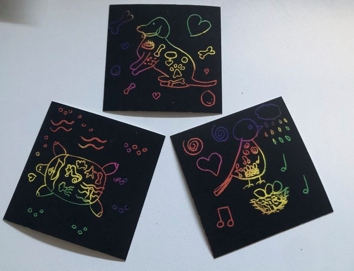
I was inspired to make 3 different drawings that would be animals that are my most favorite. I used the scratch art stick to make different symbols that represent the animal and are easy determining symbols to see what the animal is if you didn't see it. I wanted to be creative and make each animal unique in a fun way.
|
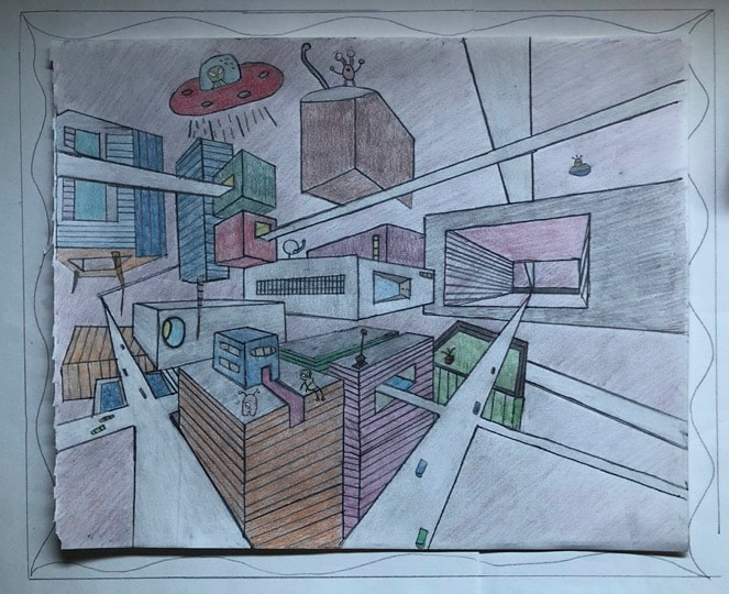
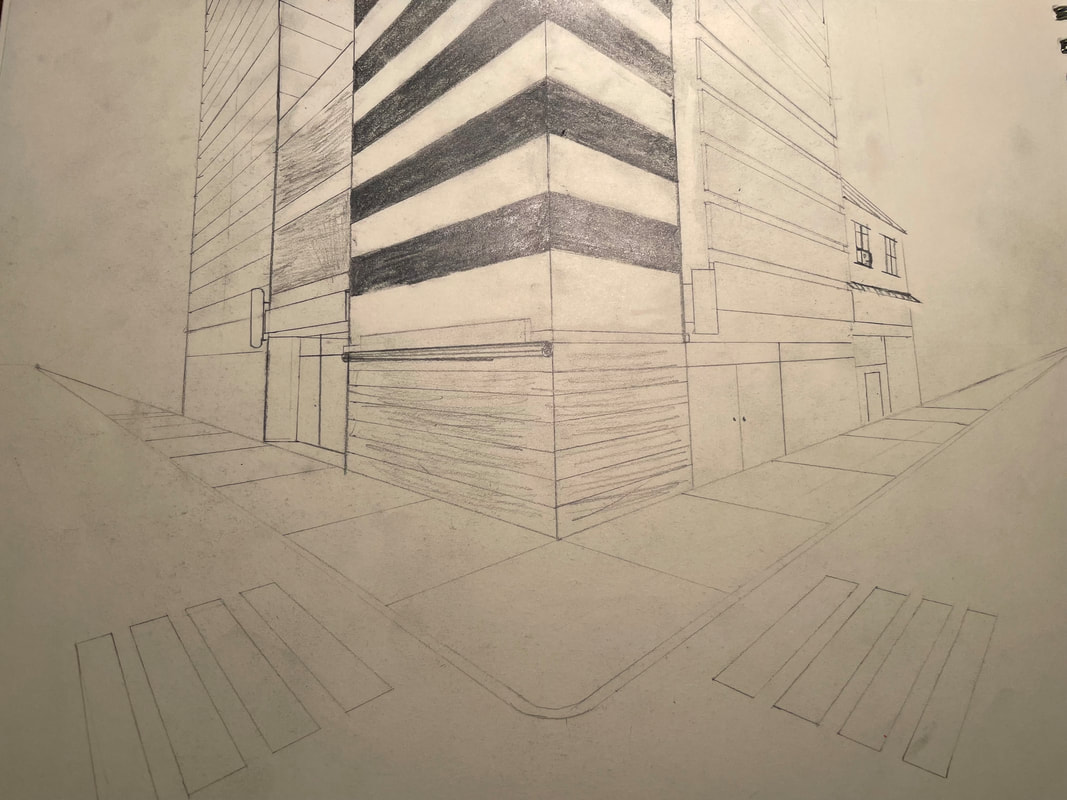
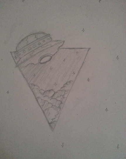
In my art, I like to include visuals that make the art look as if it is like a picture taken of a place. I want it to be as realistic as possible compared to how things look in the real life perspective of someone. I’m attracted to this subject because drawing that represents what you would see in real life of something interests me because 3D objects stand out and make the art even more interesting to look at. With this in mind, I wanted to create something futuristic looking, that reminded me of space and aliens. I used pencils of different types including shading pencils, normal writing pencil, and watercolor pencils.
With the drawing and shading/sketching pencils, my process was to draw perspective points that would be one of my main components for making my drawing look realistic and make it look as if you were looking at buildings in the real world. My purpose to create my artwork is to interest people and surprise them about perspective art. I wanted to mimic the perspective of what you see through your eyes or a camera of an object or area. I also wanted to create something that would enhance my art skills and ability to make things look similar to real life. I took risks that I usually wouldn’t do in my art, so that I can make art that pleases me and is something that I’m proud of. I created this to give hope to people that want to try creating their own perspective art. I am a beginner and I definitely gained confidence that I can draw better after this art project. I let my imagination take off after I got the hang of making realistic buildings and structures, roads, etc and continued to use my perspective points to keep it in order and to keep in the right perspective.
|
Seth B.
I wanted a heroic feel to it. Instead he feels alone. The empty streets around him. He is the hero no one needed but got.

Chinese/Japanese architecture is very interesting and beautiful. This was used to create a serene landscape a calm place. The panda could also represent this. They are very majestic.
|
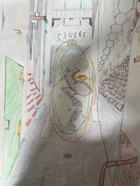
This is a forgotten alley. Outside the alley is what the world is then. Plain and simplified. It lacks character. Feels robotic. No nature. Just black and white. The portal in the center of the alley represents returning to nature. The alley is full of character compared to the main street.
|
Jackson B.

This was my first drawing and it taught me how to make it all even.

This was my second drawing and it was my favorite since I finally did what I wanted.
|

This was the most recent I did and I am very proud of it.
|
Justin B.
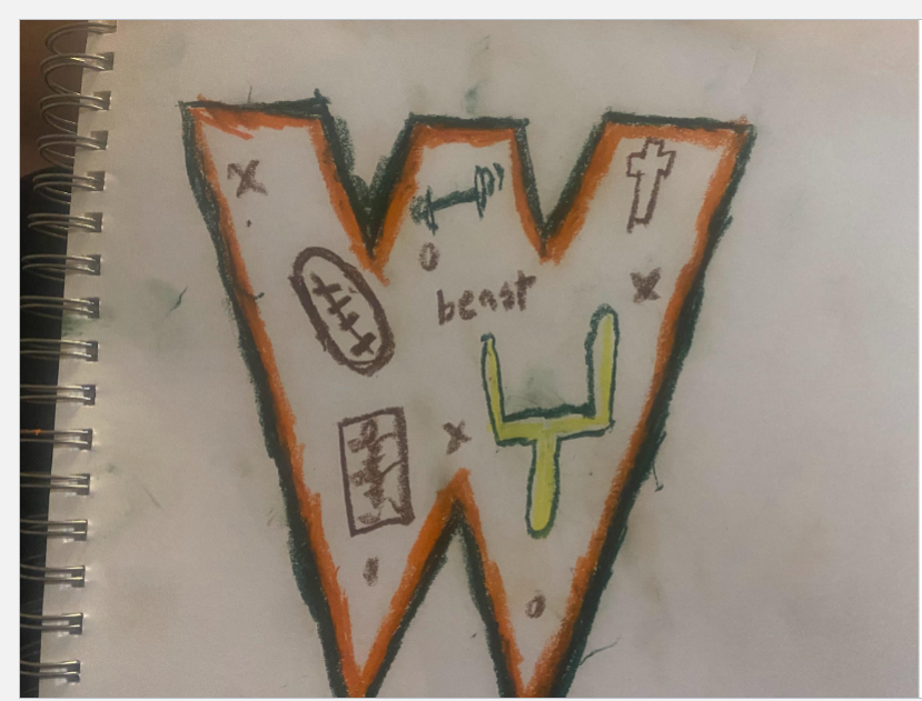
For my design I
wanted to do
something that fully
represent me as an
athlete. The thing
inside of the letter
represent the sport.
The thing thing that
took the most
brainstorming is the
letter. I made the
letter a W and a M
for the M meaning
mojave football
team and the W
meaning WIn. I did
this to show what I
am all about.
|

For my symbol I wanted to represent the sport I play and what it means to me and how it is my world. I wanted to make a
planet in the shape of a football for my string art.I used the string and glued it to my paper to make the landforms of my
planet. I have spent almost six hours on this project. The hardest part was trying to keep my string on the lines and adding
detail so it actually looks like a planet.
|

How did I become attracted to the
subject? I became attracted to my
grid drawing of a football player
because I always loved the sport
of football and have won two
state championships in the sport.
Football is a part of my life seven
days a week weather it is
watching film, practicing, or
playing a game. It is huge part of
my life so that is my how. My final
project is going to be made of
regular and colored pencils. Why
did I choose this? The reason why
I chose this is that the artwork I
chose was the closest from of
atmosphere of the event.
|
Drew B.

This is the Millennium Falcon from Star Wars.

This a a dragon drawing that I made using shading pencils.
|
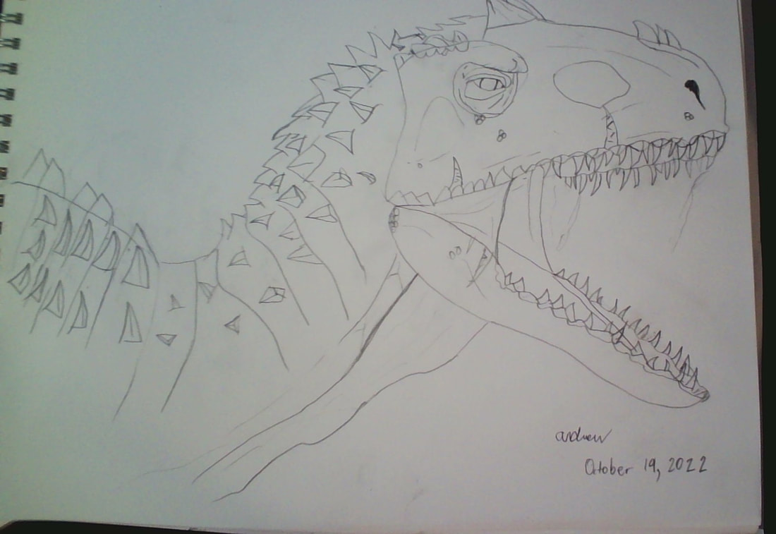
Here is a drawing of the Indominus Rex from Jurassic World.
|
Payten B.
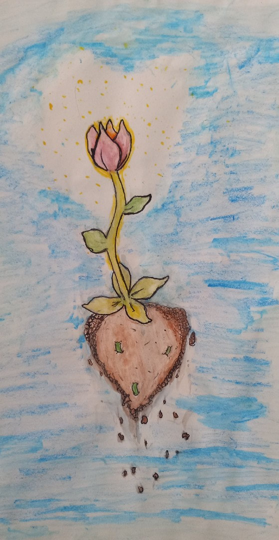
I made this one with my water color pencils, this represents how you can be the light of the world as you see the little flower that is giving off light.
I made this for the 10 minute drawing, I really like horror and scary stuff, so I made this.
|
I made this for my yearbook entry, I like this one because it shows our school colors perfectly.
I made this one with a sketchbook starter, I liked it so much that I improved it and added life to it.
|
I made this with my charcoal art, I really like how I added the shading.
This is one of my first charcoal projects that I made I really like it and how the dark background gives it depth and makes it look like its sinking into the paper.
|
Ava B.
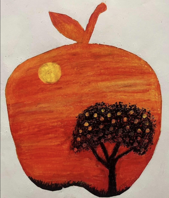
For my oil pastels project, I decided to go with an apple outline because it's a simple and versatile design. For this project, I decided to do a sunset with a warm color palette and an apple tree. I chose a warm color palette because it was fitting with the apple’s red color. First, I put down a layer of yellow, then, I layered all the other warm colors on top of the yellow starting with the lightest colors to the darkest colors. I used sgraffito to make the sun and the apples on the apple tree. For the leaves on the apple tree, I used stippling to add texture to the leaves.
|
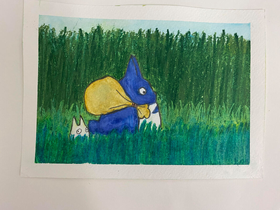
For my watercolor project, I decided to recreate a scene from the Studio Ghibli movie My Neighbor Totoro. I chose to do this scene because My Neighbor Totoro is one of my favorite movies. In the original scene, the two characters pictures were walking on dirt with tiny grass patches, but I decided to use tall grass in my artwork to make it original. I used watercolor pencils for the two characters in the middle, the front part of the grass, and the sky. I switched between green and blue to create variety for the grass I made using watercolor pencils. For the third row of grass, I used various green oil pastels. Finally, for the second row of grass, I scraped away the oil pastel from the third row of grass to reveal the watercolor underneath it, creating the second row of grass.
|
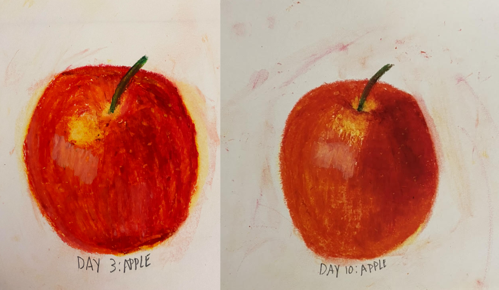
This artwork is from my 10 for 10 project where I spent 10 minutes (although I think I went over 10 minutes) each day for 10 days creating an artwork. I decided to draw different foods using oil pastels so I can learn more about how oil pastels work and how to shade with them. For day 3, I drew an apple based on a reference image I found on google. I used a yellow oil pastel for the base layer and layered various different red oil pastels on top of the yellow creating the color of the apple’s skin. Then, for the final day (day 10) I drew the same apple I drew for day 3. I used what I learned over the 10 days of doing this project to improve my apple drawing and make it look more realistic. One thing I did to improve was to use a brown oil pastel to emphasize the darker sports of the shading. Another thing I did was make the shape of the apple more accurate to the reference image and less round like the drawing from day 3.
|
Eli C.
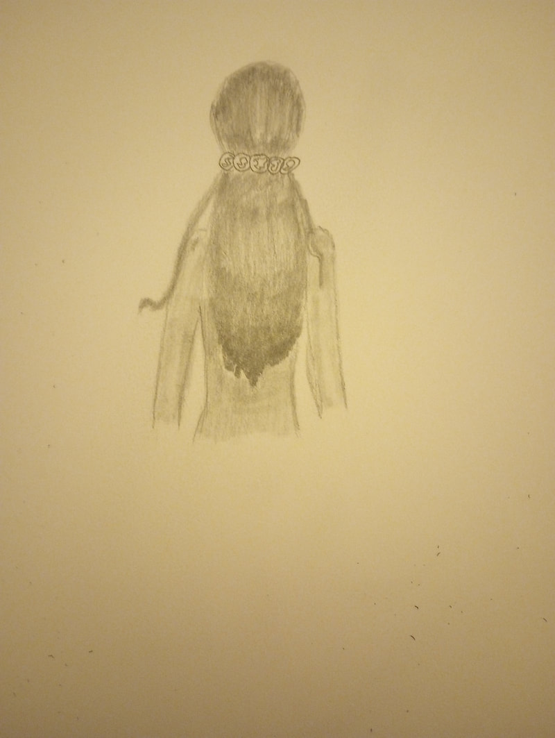
This picture is of the back or a girl, or woman. I got into hair, and was amazed by other artist who can design their sketches so well, and make it so realistic. This was on of my first times really trying it, and I'd say it's not a horrible start.
|
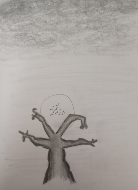
I wanted to convey feelings in this picture. It can mean different things to different people. It can stand for the sadness, and when we feel alone, but it can also be a symbol of hope, that we are still standing and it's going to take more than the cold, and the wind and trials the bring us down.
|
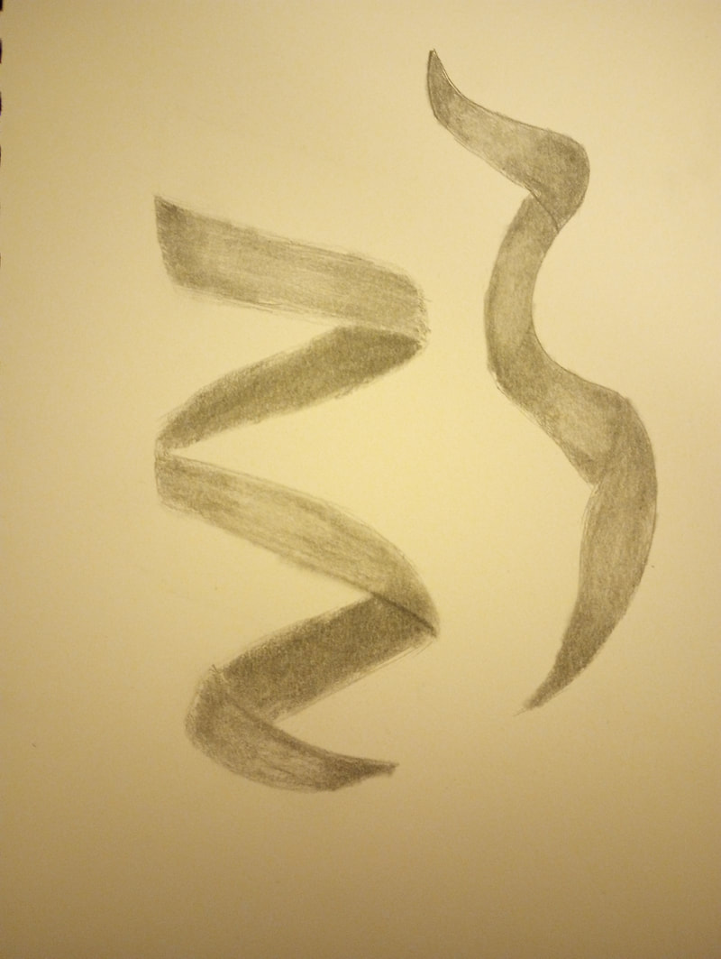
This picture is of ribbon. I wanted to capture depth and perception. Though I am not great at it, I know if I keep practicing I will get better.
|
JC
So for this work, I was testing the grounds with watercolor pencils, and the different ways I could utilize things like oil pastels in conjunction with them. And so I decided to use this new medium of art to draw one of my nearest and dearest allies, my stuff toy "Sir Puffins"!
|
In this piece, I tried my hand at creating glitch art, and of course I used a subject-image of my dearest and nearest friend, Sir Puffins! After digitally scrambling the image a bit, I went into a digital editing program and messed around with the color and distortion levels a bit too, and generally used this work of art to get more familiar with digital mediums of creating art!
|
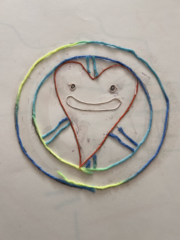
For this work, I began by creating a symbol that combined three things that I thought were values I held close to my morals, a smiley face, a heart, and a peace symbol. And I morphed them into one logo. When I finished making the logo, I then began to create string art out of it! It captured my interest because I had never quite done anything artistic using string before, so everything and every step involved in making this work of art was a wonderful surprise as I made it! I mostly used this work of art to have fun and try out a new method I hadn't been familiar with, and I like how it turned out!
|
Faith C.

I’m a big fan of flowers so I knew that I wanted some in my symbol. The cross is actually a symbol that I’ve always had, I have a necklace that I wear that's a cross. I've had it since I was a kid. The flower in the cross is supposed to be a lily. It's my favorite flower and I was born in May so that's my birth month flower. Finally, roses represent love and it is my second favorite flower. I decided to use the string for the lily. I thought about making a pom pom for the top of the flower but decided that it wouldn't look right. I used the yarn for outlining and the rose because it swirled nicely to make a rose shape.
|
God's Eye/Ojo de Dios Weaving
|
Digital Art
|
Jamaica C.
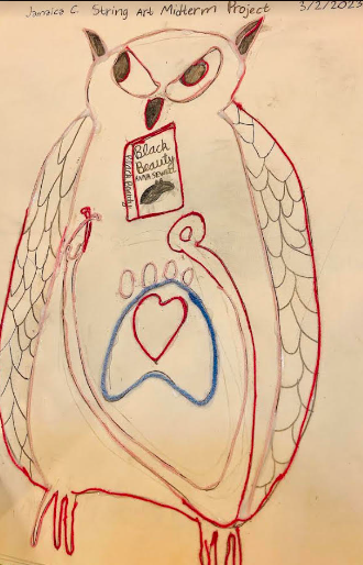
This is my art midterm. In it I depicted 3 things I love about myself: my love for literature, my passion to be a vet, and that I am a night owl. I like how it turned out because I was able to neatly display who I am through art, which is something I really love to do.
|

This is my recreation of a painting I found, in which I depicted Julia Gaffney, a Paralympic swimmer with a limb condition. She's an inspiration to me because I also have a leg condition and I really love to swim to help my muscles. In the future I want to be involved in something to raise disability awareness.
|
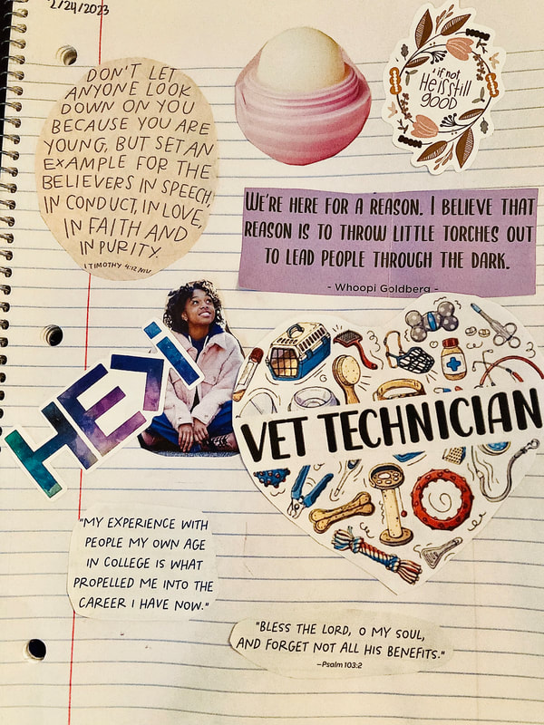
This is one of my vision board collages. Collages are one of my favorite types of art because they are very open-ended for a flow of creativity, and I'm able to find a lot of great inspiration. It also helps me to explore my personality, and is very therapeutic.
|
Lincoln C.

Scratch Art
|

Midterm Drawing
|

Coral Reef
|
Ben C.
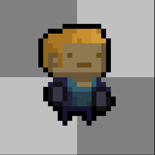
For my game development, I spent a really long time trying to draw up a main character sprite so that it wouldn't look weird. I might redesign it later in the process but I like how he looks for now. I just need to animate him.
|
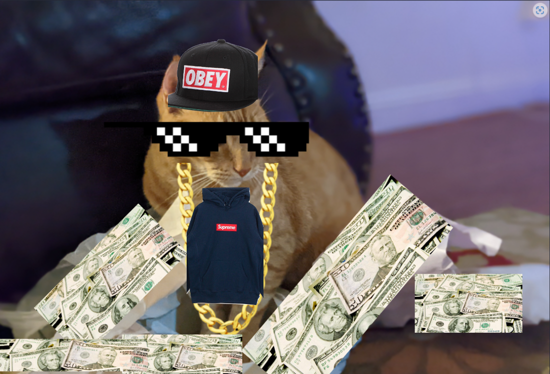
This one's actually pretty funny. I'd never used photoshop before so I thought it would be fun to do it for my cat. I messed around with the photoshop software and ended up coming up with this.
|
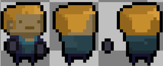
This is just some facing directions for the character. It was hard to make these as I had to keep the same shape for him while making the different sides look normal. As this is my first pixel art character, it took a lot of learning to make different perspectives.
|
Dorlhy J.

God's Eye or Ojo de Dios Weaving
|

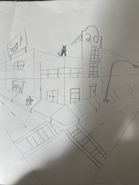
One-Point Perspective
|
Sadie C.
This piece of art took a lot of hard work. I had to pay attention to the details and know where to place certain things. I had to learn how to make the flower pop and the other objects get blurred behind it. I learned a lot about shading and blending while working on this. This was a very fun project to work on as it tested my talents.
|
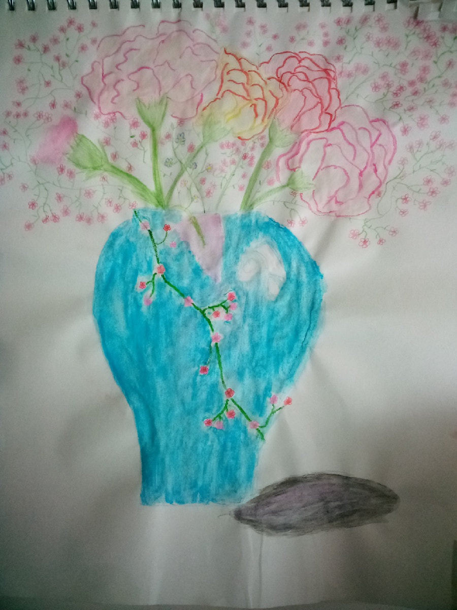
This artwork was very fun to create! I used watercolor pencils and a paintbrush. It took a lot of time especially adding all the small little flowers. Using the watercolor pencils helped me add more details and make the colors darker if I wanted to. I love carnations so I decided that I would draw them and see how they turned out and they turned out very nice.
|
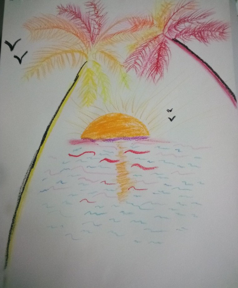
I loved working on this piece! I used oil pastels and bright colors! I love sunsets and the beach so I decided to use the colors from a sunset and make an ocean scene. The oil pastels were really easy to use and they gave the effect that I wanted. It was a little hard to do some of the smaller details because the tips are round but overall they worked really well for this piece.
|
Aaron D.
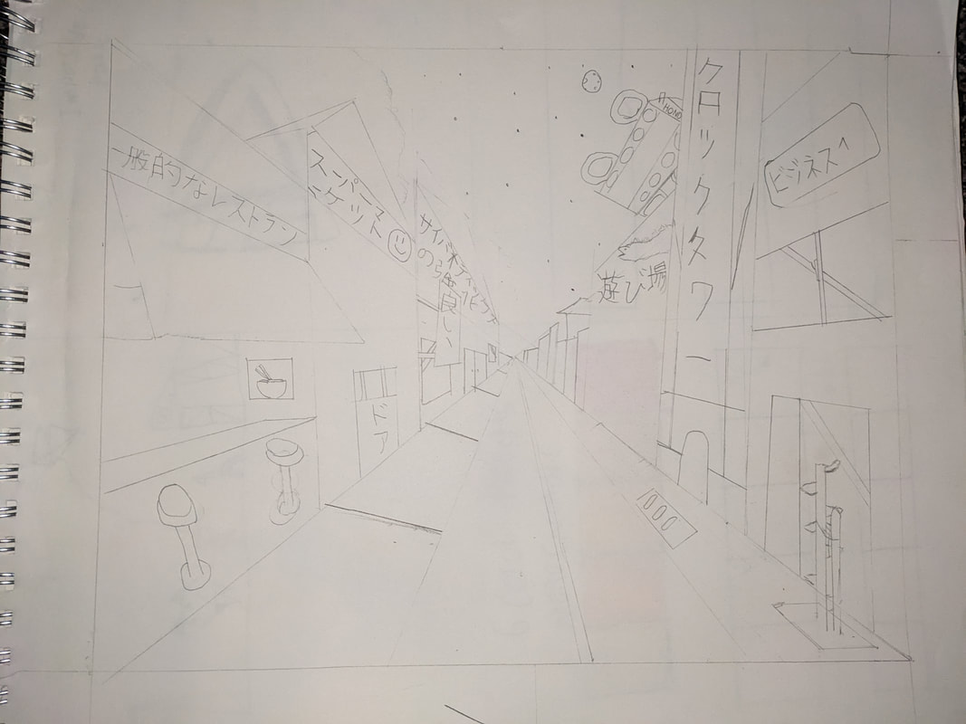
This is my strongest piece of art from the first semester. When trying to draw my cityscape, i took inspiration from cyberpunk stylized cities presented in games like mirrors edge. I also tried to make sure it all looked very neon, taking inspiration from Tokyo in Japan and times square in New York. I also added a very futuristic flying car to add to the atmosphere of the piece.
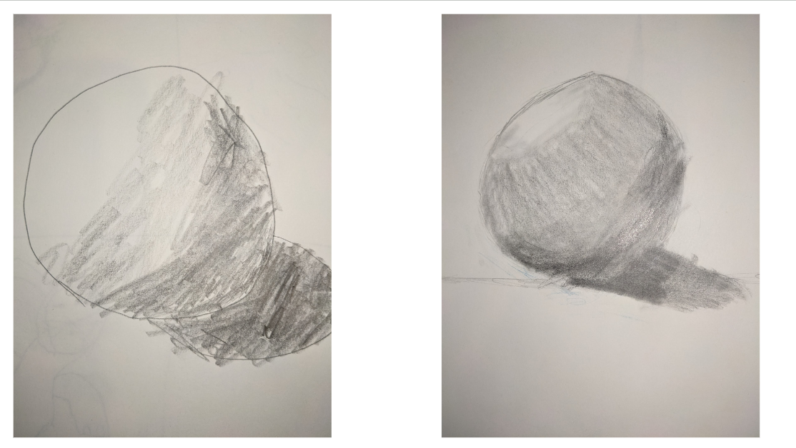
These two pieces I feel demonstrate the most growth. The first image is a sphere i drew at the beginning of the school year, while the second is one that was drawn far later. I think the difference in quality in the two is very clear and shows my growth as an artist.
|
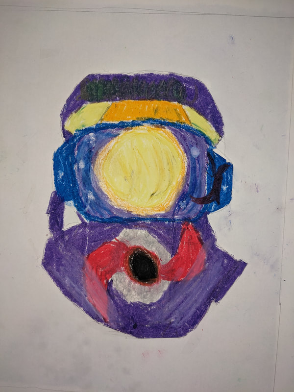
This is an oil pastel illustration in which i attempted to demonstrate positive space. I tried to make it look like the image may be reflecting off the visor of the space helmet.
|
Cessiah D.
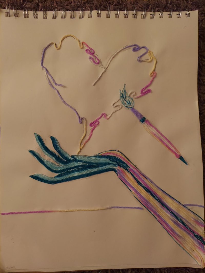
I created my symbol by illustrating how I am and my likings. The heart means loving, the brush means creative, and the hand means giving. I chose the heart to not have a lot of string because when I think of hearts I say they should be opened with plenty of space. I wanted the brush to be the opposite color of the heart so it would be unique (read the end for the meaning). Lastly I wanted the hand to have an incredible vine that was so strong that it made the whole hand blue. Why did I make the hand and vine blue? Why was the brush blue? Blue has a beautiful meaning, it means freedom, imagination, inspiration, sensitivity, and open minded/open space. In my opinion everyone should have some blue in them!
|
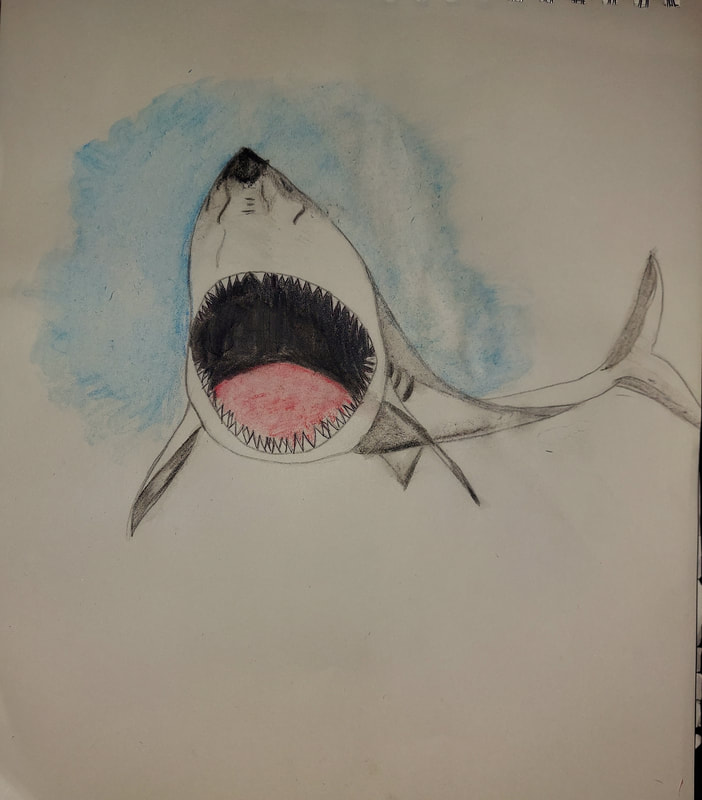
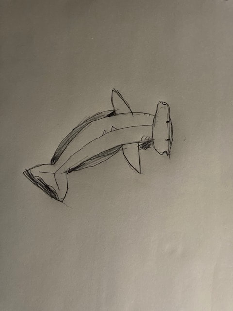
In my art piece I made a shark because they are my favorite animal since I can remember. I find sharks very unique and curios. As much as I love sharks I would never want to be next to one. They are a beauty from afar. I also chose sharks because they are very mistreated and have a bad reputation. In other words sharks are one of a kind and should be treated with kindness and left alone.
|
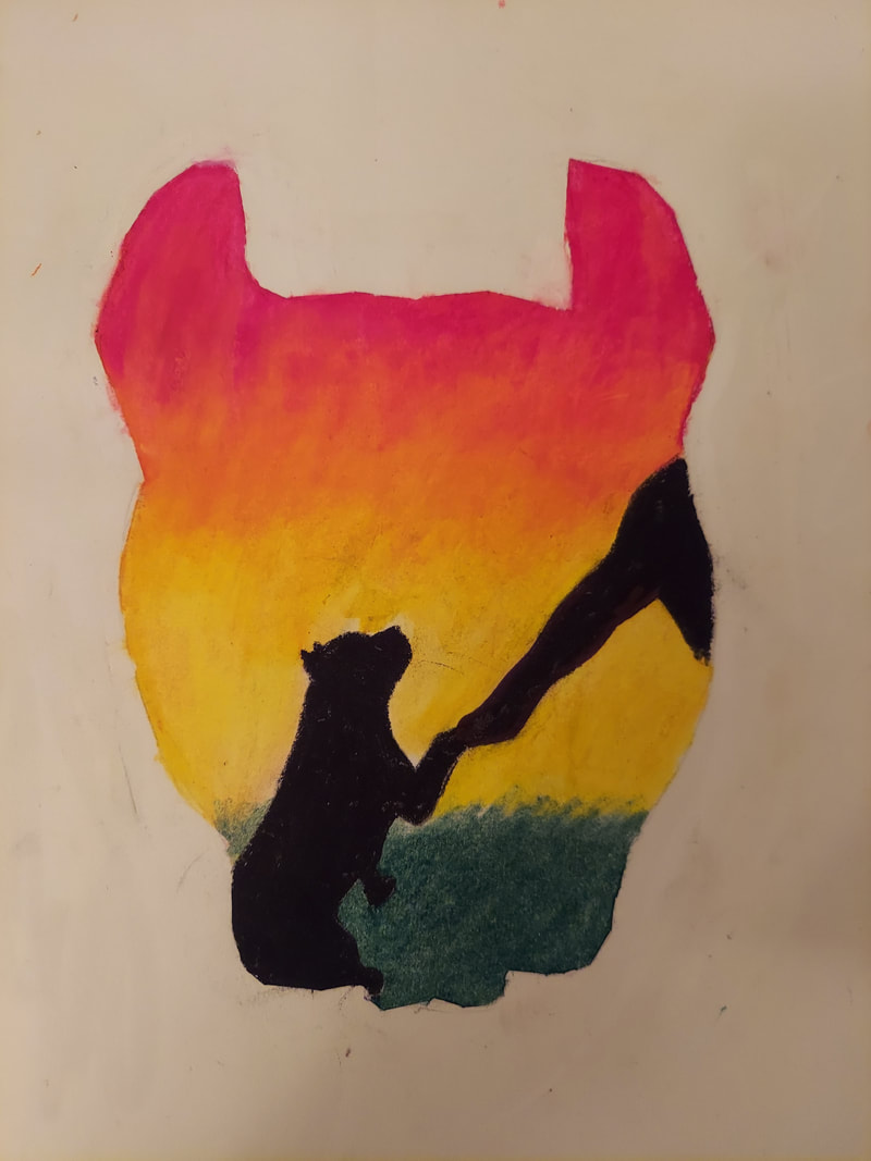
The beauty of dogs, Angelo. Dogs like Pitbull's, XL Bully’s, cane corsos and more have been mistreated for many years. I have always seen the beauty in them. I have a dog of my own who is the sweetest little boy and I wanted to show how colors can define drawings, music, and overall art. The meaning behind the sunset drawing is that I wanted to show how comforting and sensitive they can be when they are far from us or close.
|
Gracie E.

Midterm Drawing

Scratch Art
|

Georgia O'Keeffe Drawing
|
Logan E.
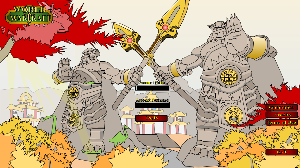
This is the login screen of World of Warcraft, my favorite expansion. This one is done on the single worst art platform in history: Google Slides. Everything here is hand-drawn using shapes, polygons, and colors all from Google Slides. It just tells you that you can create art no matter what you're using.
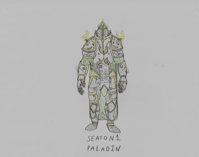
Inspired from the holy paladins from the game "World of Warcraft", I wanted to make an armor piece with the paladin theme along with a theme of my own.
|

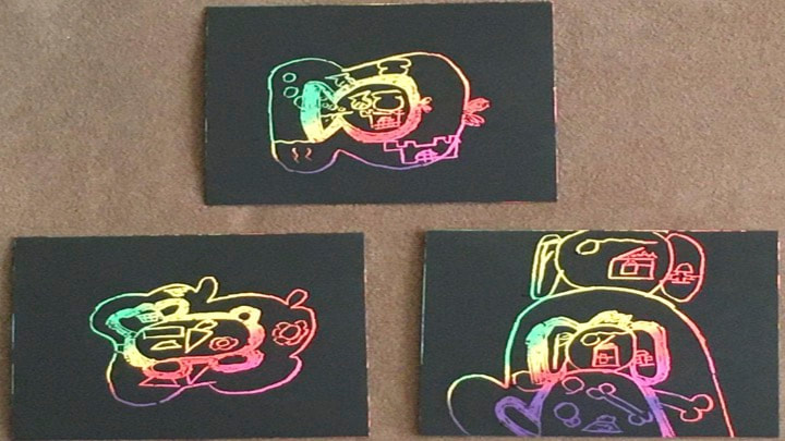
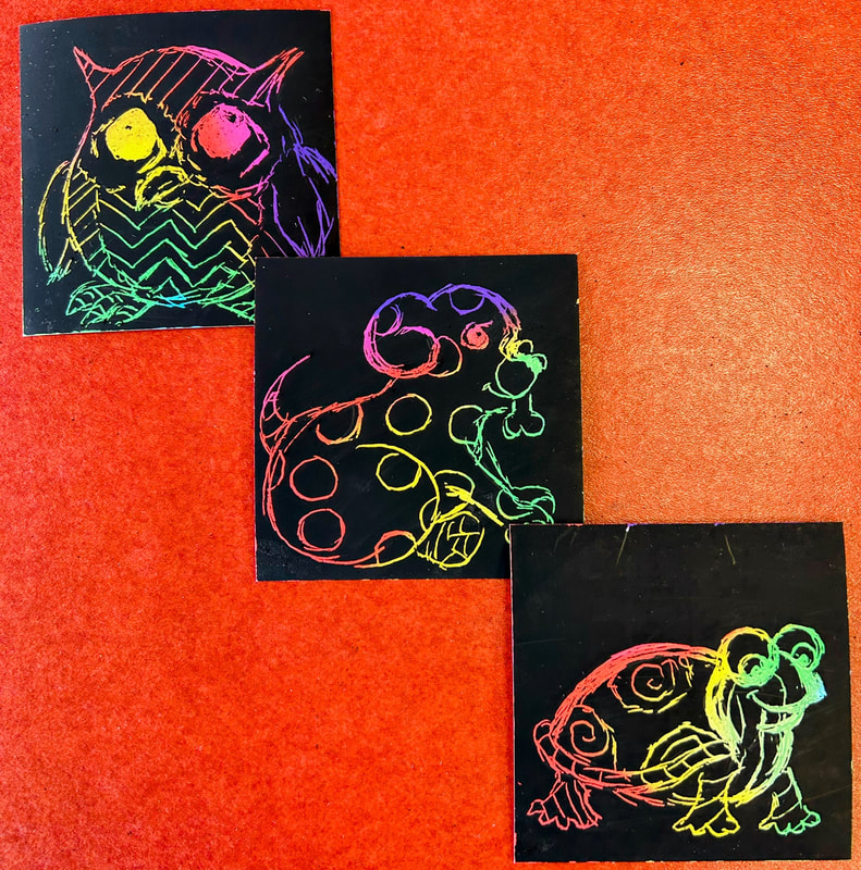
For these scratch art pieces, I was thinking of doing a dragon, warg, or some fantasy creatures but I wanted to draw something closer to home. I first planned out doing Nevada’s state animal: the bighorn sheep and decided Utah, because we have many friends and family there, and a alligator for Florida because, why not? I’m happy I was able to portray these the way I wanted and create some nice state representations.
|
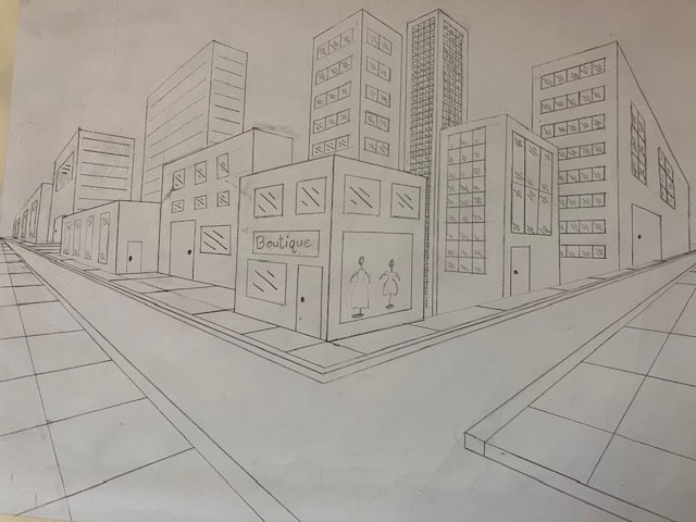
Tierra G.
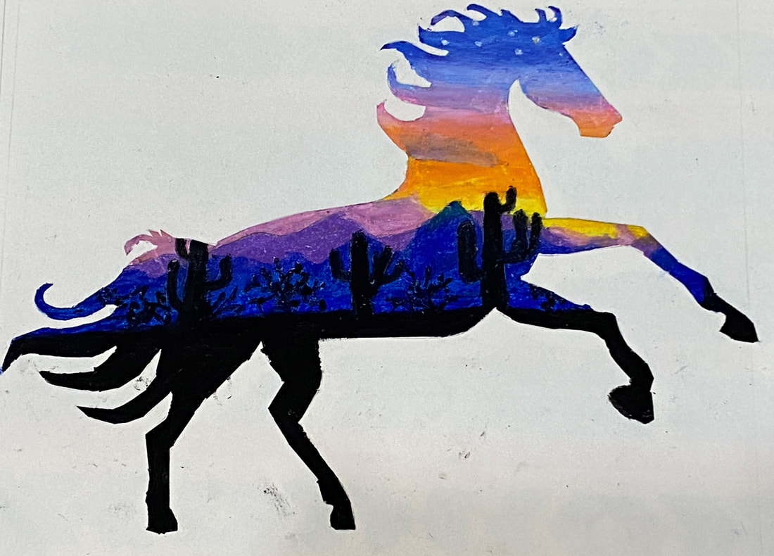
For the first image, I made this silhouette drawing of a mustang with a desertscape inside it using oil pastels. When I first began coming up with ideas for this project, I had decided that I wanted to draw a desert landscape, and I thought that using a mustang as the outline would be a good connection to a desert, as Nevada is home to the largest population of wild mustangs.
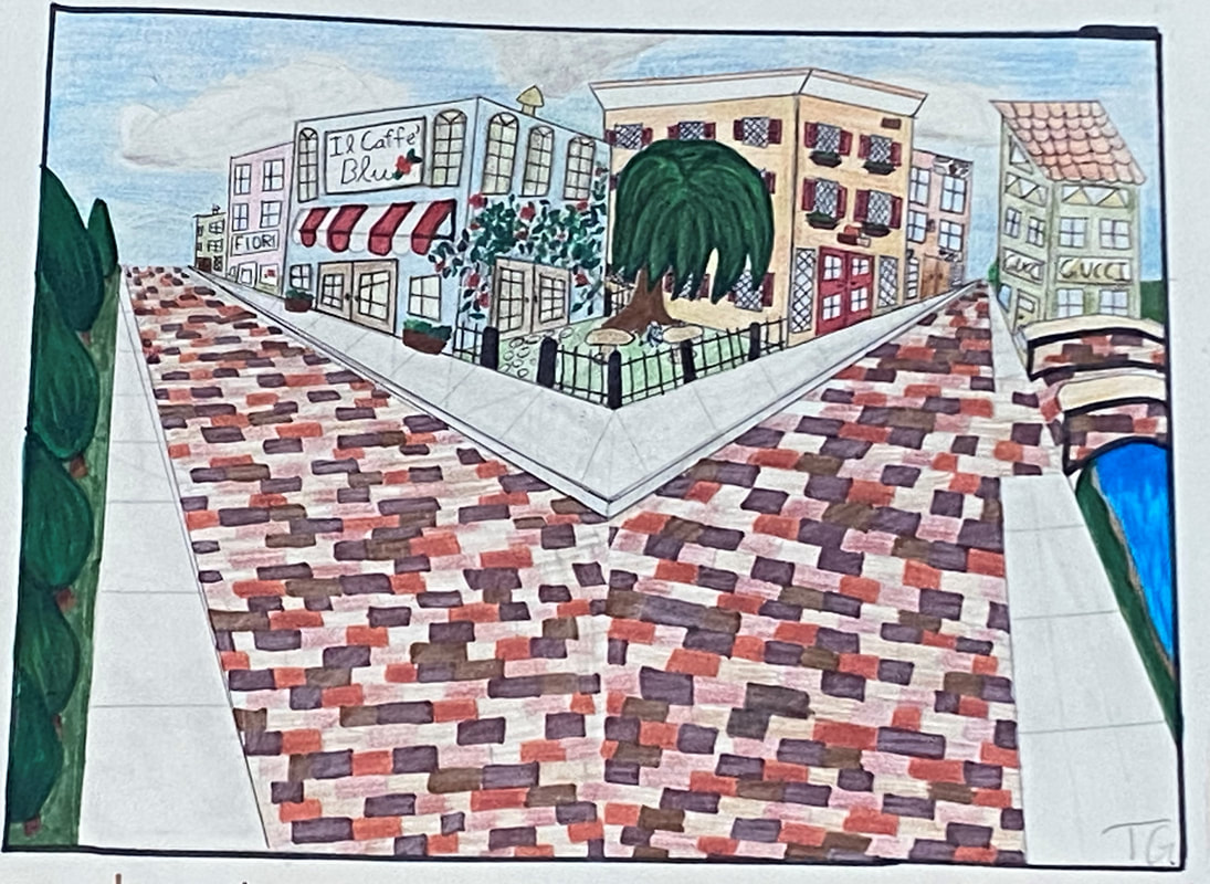
This perpspective drawing I drew is by far my favorite project I've made so far. For the project, I decided that I wanted to design the buildings to look like it was in a little Italian town, and I think I was able to show that by using several components like Italian architecture (brick roads, slanted/detailed roofs, Italian-style windows,) native plants, and I even made a litte cafe with the Italian translate of "The blue cafe" and a small flower shop next to it with the Italian translate of "flowers."
|
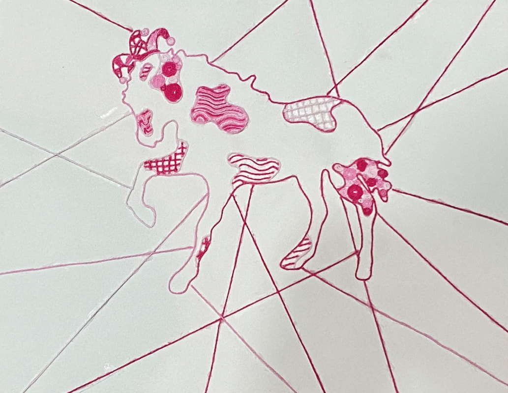
For this project, I made an emblem that represents three attributes of myself: creativity, humor, and horses. To represent these three traits, I first used a horse as my base, and then to show creativity, I made several splotches on the inside of the horse outline, each have a unique and fun pattern. Lastly, for humor, I added a jester's hat to the horse's head on the outline. And because the project was supposed to look like string art, I criss-crossed and connected string to the area around the horse, so it could mimic the traditional design of string art.
|
Annaliese G.
This is a water Lilly I believe, and to work on shading we did this in class.
|
Being bored in class always perks your drawing ideas and so I just started drawing and got this.
|
The pen is my favorite thing to draw with, I really like they free look in it, and just drawing without worrying about messing up is just relaxing, and when you do mess up you just make it apart of the drawing.
|
Ryder G.

It's a flower that we made in class.
|

Made a bowl of ocean cereal.
|

I made this reef based off a fairytale-like story.
|
Sef G.

Intro Drawing
|

Midterm Project
|
Veisi G.
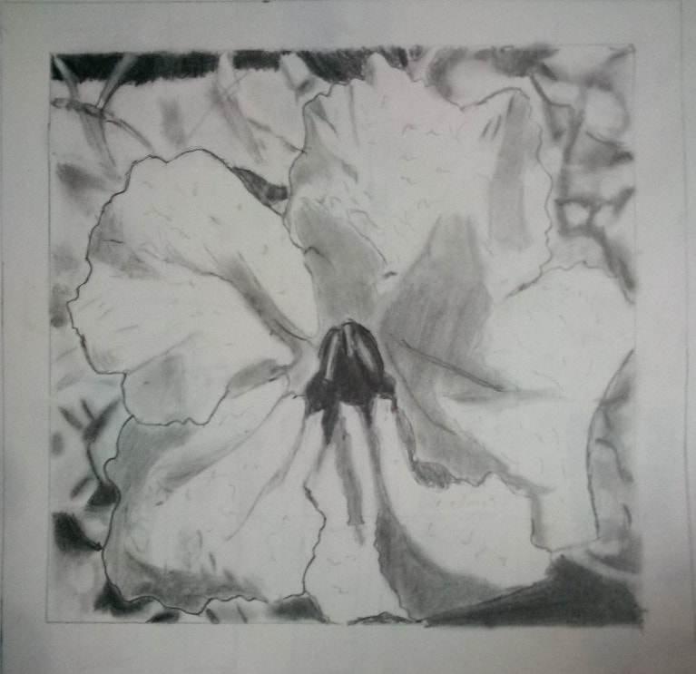
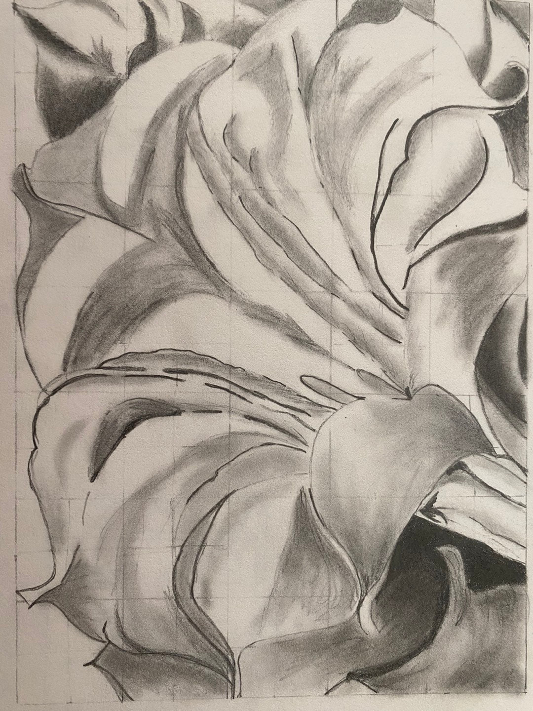
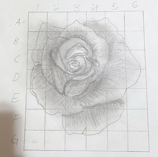
In this piece of art, I used the Grid Drawing technique to draw "The White Flower" by Georgia O'Keeffe. I used my drawing pencils to create this. Also, I added depth to the drawing using shading and tried my best to capture the differences of each of the lines.
|
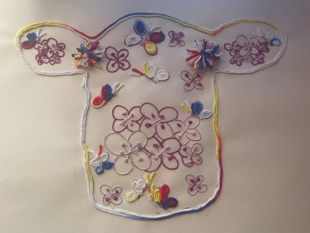
In this piece of art, I created my own symbol that represents three of my attributes shown through String Art. The Cow represents caring, the Butterflies represent maturity, and the White Jasmine flowers represent gentleness. In this project, I tried my best to use the string in many different ways to show variety and differences in all three of the symbols.
|
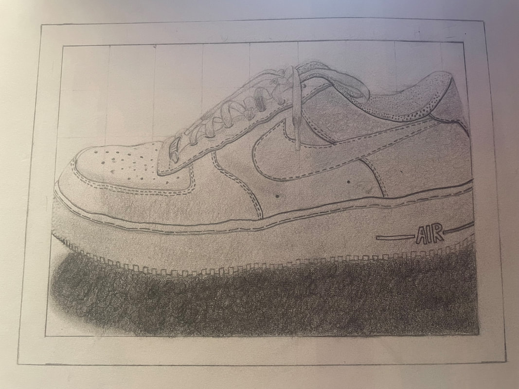
In this piece of art, I used the Grid Drawing technique once again, but this time to draw one of my Air Force 1's. I used my drawing pencils to create this, which helped me a lot with my shading. Additionally, I made sure to capture the small details on the shoe, which included the stitching, the curves in the shoe, the inside padding, etc.
|
Cainan H.
Scratch Art Animals
|
Midterm Drawing
|

Georgia O'Keeffe Drawing
|
Sam H.
So I'm a perfectionist and making something that I could just use tape and watercolor pencils seemed pretty intriguing to me. So I made this piece because I love to blend colors together and make something satisfying to look at. I made this piece with watercolor pencils and then used tape to keep the lines clean. It's a pretty simple piece of art but it took me awhile to make and I enjoyed painting it.
|
This piece was one of our assignments in class, we were doing a perspective unit. I really enjoyed making this piece because I love when things line up and when I can create the effect that I was going for. I used a ruler and a pencil for this piece. I'm really proud of how this turned out and I am happy to present it.
|
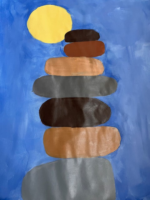
This piece was made because I was just messing around and this is what came out of it. I started by just drawing a bunch of lines and then they turned into rocks so I got the paints out and started filling in the rocks and then I made a sky in the back. This piece is simple but I am really proud of it and I am glad that I get to show it.
|
R'reanna H.
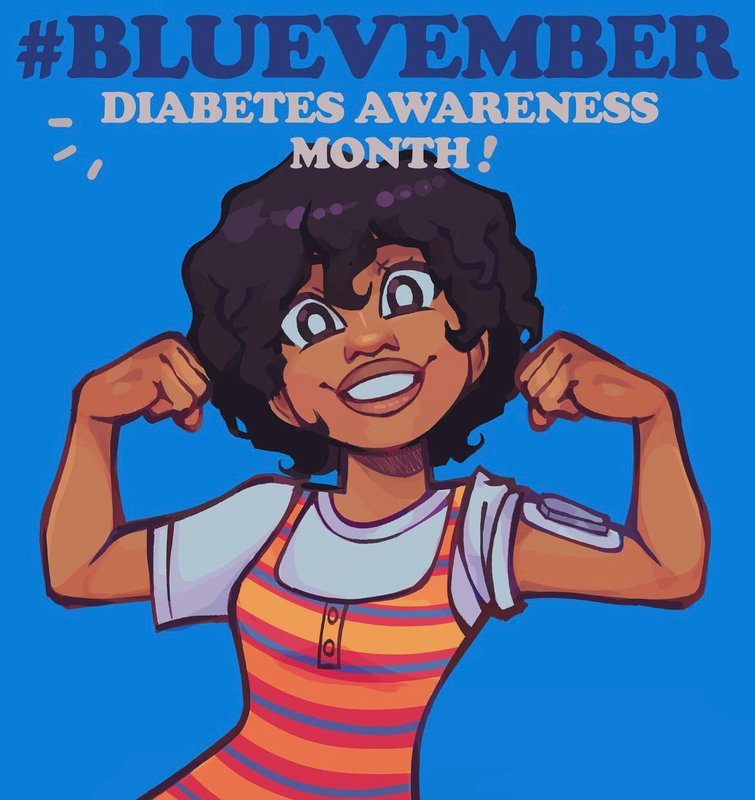
In addition to being digital, my first piece of art was inspired by a girl I saw on social media who had her blood sugar levels drop from 12.7 to 4.8.
|
This colorful sketch, which I made at two in the morning, is my second artist statement.
|
My third artist statement is a hasty drawing I made while taking a photo of the cover of my sketchbook and importing it to my iPad so I could edit and draw digitally.
|
John I.
The reference behind this piece was a picture of a few aquatic plushies that I had in my room due to the fact that we were using watercolor. I tried to use black watercolor pencils on some of them and ended up spreading out the color, but it didn't make too many big differences. At the time, I think I tried to blend in the black water color with the white background, but it ended up pretty poorly.
|
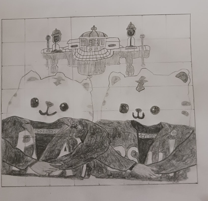
My drawing was made using nothing but F and B sketch pencils and a reference which was just a picture of my two stuffed animals that were wearing these silly jackets I cropped over them. I decided to change what was said on the jackets to "play" and "osu!" This is the SECOND time I've done this, with the first time being in my one-point perspective drawing. There was also a building that I put behind them so that the background wasn't completely blank, but looking back, I guess it didn't add that much. As for why I made it, of course, it was for my midterms, but besides that, I just thought it would be funny.
|
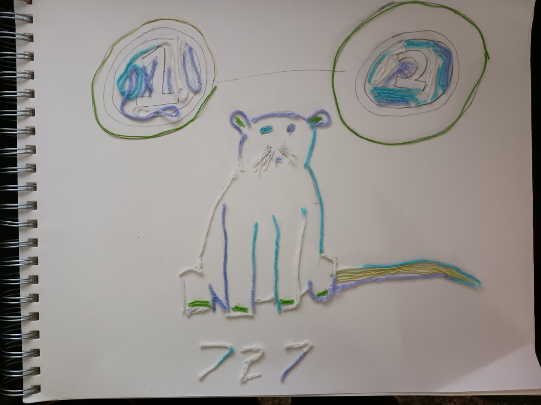
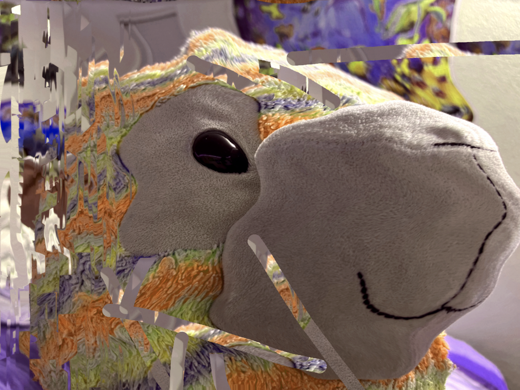
I decided to create my own symbol by mashing together things that represent me, such as a rat, a bear, and video games! My symbol is supposed to show that I'm lazy, adaptable, and that I enjoy playing games in my spare time. In my artwork, I decided to use the green yarn for anything small scale due to it being thinner than the blue ones, and I decided on how to use the blue yarn for the opposite reason, which was using it for anything of a larger scale. The only exception was the tail, which I decided shouldn't be the same as the rest of the body because there wouldn't be enough variety.
|
Bella J.
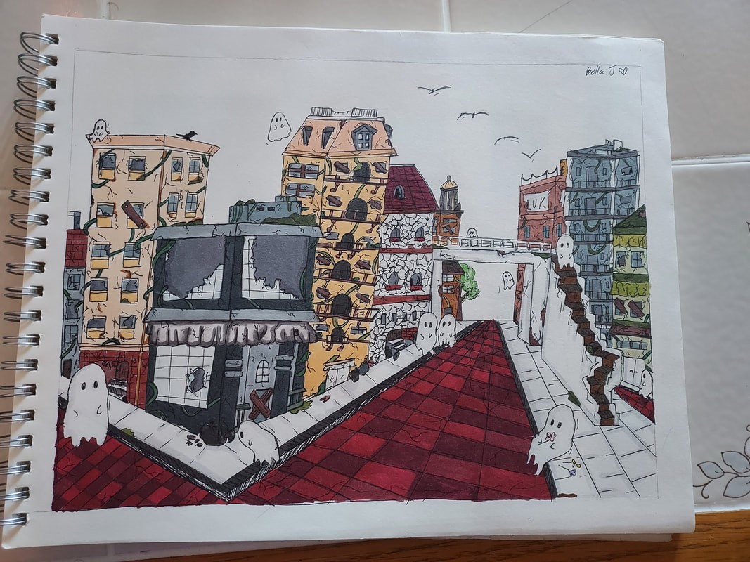
For class we were able to do something for our midterm, per our choice. I chose two-point perspective of some buildings that would represent an animated ghost town . This project was one of the fun ones that I had done and really made me committed on each detail. Being able to show fun in something not a lot of people believe in (ghosts) made it fun. If I could do projects and art like this all the time, I'd never complain. There's a feeling in a piece I feel proud of, the feeling is love and I LOVE this piece.
|

I made a drawing for an assignment one of my last days of our 10-10 drawings and I chose Medusa. Medusa is a highly known woman who would make curses on anyone who gazed at her due to a curse put from Athena. I look at Medusa as misunderstood, not entirely known for much more than she should. She's a woman that needed more representation.
|

My last artwork is on Romeo. Not the original but the Romeo from an artist named "Sergio Cupido" who made a poster of Romeo and Juliet. I have attempted paintings of Romeo and several drawings and were pleased so I did it once again. Romeo is a very know story with Juliet, the love and death. But weirdly my main was him.
|
Kiara J.

I created my own symbol by figuring out what my three attributes are. As I
have many it’s always hard to pick just three. So I came up with figuring out the animals I
wanted and making sure they represented the attributes I wanted. So I chose the lion to
represent morning because they hunt in the early morning and I’m a morning person, and it is also the animal for my zodiac sign. The wolf represents loyalty. I am definitely a person who is loyal to those who are loyal to me so I like that the wolf represents this, and it also represents good communication. The griffon represents leadership and strength which are definitely a big part of who I am. I am a natural leader. So how I came to get the symbol I decided to do the lion head, and front legs then I did the wolf body, back legs, and tail. And finally, I decided to do the griffon wings. Also, instead of doing paper and glue with the string, I did a wood piece with nails and string. An additional thing I did was add some details to the background of my project is adding my initials and a letter since I love writing then I decided to add the phrase “Senior 23’ “, and I added this because I am graduating high school in a few months and I plan on keeping this project. I had a lot of fun creating this project and of course, it had its moments like dealing with the nails and then having to switch colors which involved tying off. I will remember this project for the rest of my life.
|
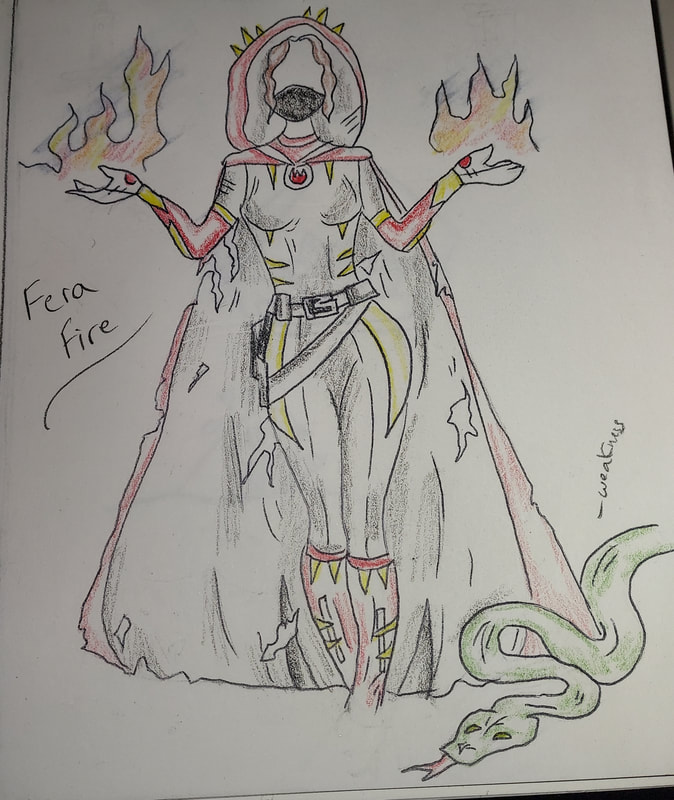
I created an original villian with her own superpower. I named her Fera Fire. She has a hooded cape that has a ruby gem with a full body suit, and red boots. She has a mix of yellow, and red throughout her body suit. Her pet is a snake which is her weakness because she cares dearly for him. Her power is fire from her hands. I love this villain because I created it with meaning. It's all the things I would want, and I love snakes.
|

I created a beautiful multi-colored oil pastel art. I have a butterfly in the middle representing transformation. On one side I have a girl sitting in a tree on a swing, and it has a dark black tree with blue and purple in the back. This represents darkness/sadness. On the other side is another girl sitting in a tree on a swing with red, orange, yellow, and pink in the background with a black tree. This represents brightness. When I came up with this idea, i wanted to show two sisters who were apart but will one day come together. This is inspired by my relationship with my sister as I am going to college soon. My idea in my head was perfectly orchestrated on paper.
|
Gianna J.
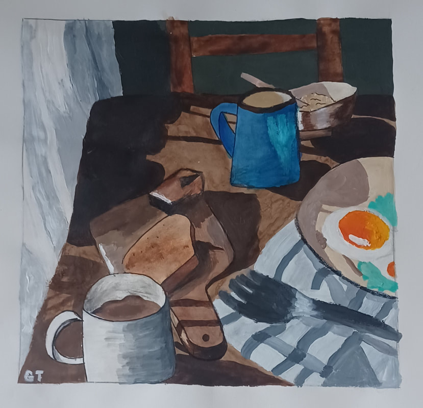
This is based on a truly inspiring photo that motivated me to create this for one of my class projects. I used watercolor pencils, watercolor paint, and acrylic paint to create this piece. It is a piece filled with a breakfast displayed on a wooden table with the view of curtains and a chair in the background.
|
This piece of artwork was for a sketchbook starter in which we were supposed to draw an anime-styled form of transportation. This is a digital piece and was created on procreate. This piece is based on a car from an anime called Initial D.
|
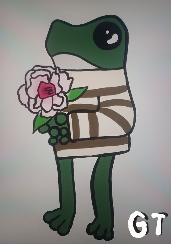
For this piece, I was inspired by a yarn frog doll. I began to draw it using procreate, a digital art program. This was for an assignment called 10 for 10.
|
Toby L.

Working on this for a couple hours was worth it. Perspective was a hard thing for me to learn but I got it down. So keep trying until you get it.
|
This is not my design it was only a copy of what someone else did. This was my first challenge of trying to get characters down or in this case dragons. Practicing on lines and character can help inspire you to make your own.
|
This guy is my favorite one. He didn't take long and looks simple but I like how he looks and he means a lot to me. Art doesn't have to take hours to make something you like.
|
Blake L.

I drew this city to make it look like a place where you could have fun all day every day.
I drew pets using scratch art and added things the pets inside the pets.
|

I drew a bird that I really like.
|
Vincent M.

My artist statement is that people like others depicting faces, so I drew a character without a face that will look equivalent to a character with a face. (I hope)
Never think people are chosen to be cool, imagine your face in someone you inspire to be.
|

Whether you're on the Light or Dark side, never stop doing your best.
|

Despite you being tried, strained by anxieties of life, or even scared, always push yourself and go beyond your limits.
The sentence drawn for the sketchbook starter was "I'm tired and stressed by life, but I keep on going."
|
Justess J.
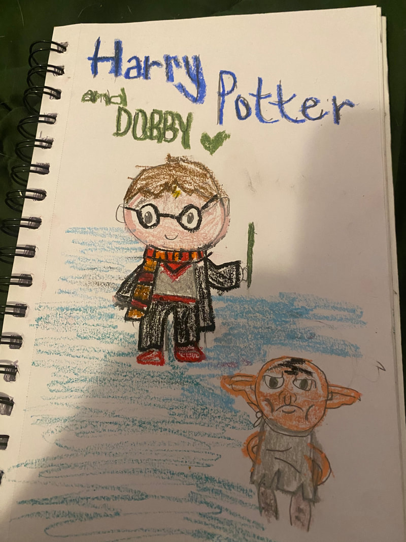
This is my 10 for 10 art piece. Basically we worked on this for 10 days, for 10 minutes a day. I drew Harry potter and Dobby.
|

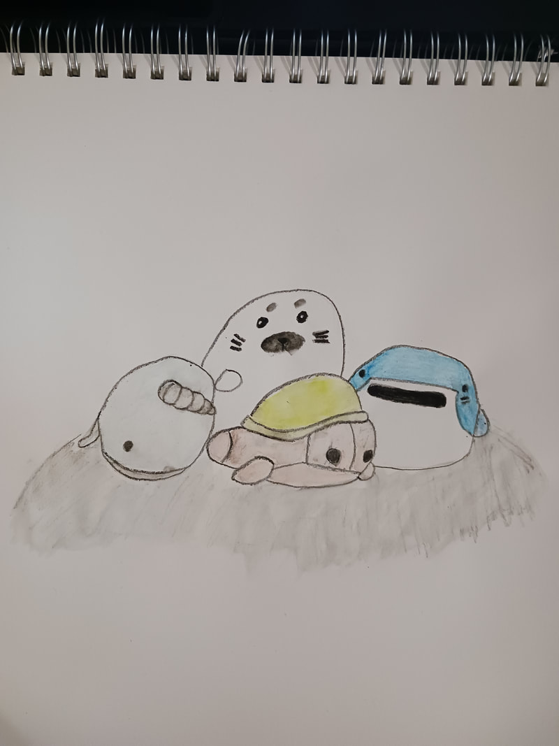
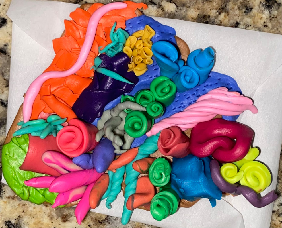
This is my coral reef project. I used colored clay, and aluminum foil. This was one of my favorite projects it was super fun!
|
This is before I glued string to my drawing. I liked it better without the string.
|
Tyson M.

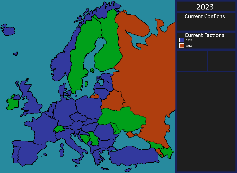
This image along with five others is a collection of art of maps that aren't likely to happen but are cool of what the world may look like in 2100. This is what inspired me to make an entire movie.
|
This is one of hundreds of slides for an alternate history movie I'm creating. This is just the first image.
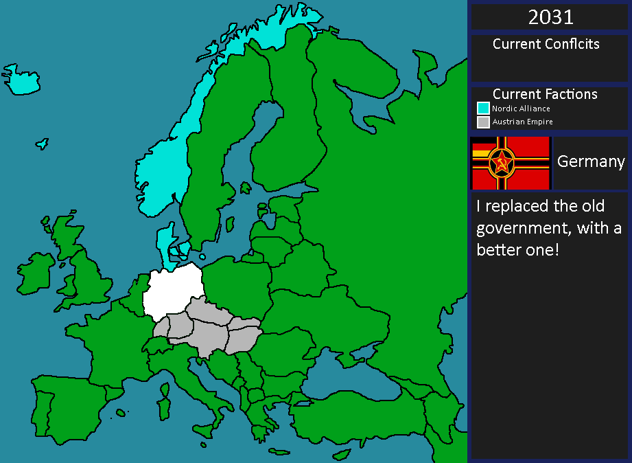
Another alternate history Image. One of hundreds. I may like alternate history, there is a chance.
|
Madison M.

For this work I used oil pastels. I had originally planned out a cat shape but I didn't know what I was going to put in the empty space. I thought making it a fish tank in the shape of a cat would have been both ironic and visually appealing. I ended up really liking how it turned out and I liked the detailing of using different colored oil pastels to try and mimic colored fish tank gravel.
|

In this work I used pencil and colored pencil. I wanted to convey a big, bustling, and busy city that was full of life and color. There are a variety of stores and restaurants all with different color schemes, so your eyes are drawn to different places the more you look at it.
|
I created this work with watercolor pencils, they were probably the most difficult medium for me to work with but I think it resulted it something really nice looking. For this work I wanted to do something related to space and planets, so I added a planet that looked like mars and wanted to add a night sky with stars.
|
Justin M.
Flower Drawing
|
Scratch Art
|

Clay Coral Reef
|
Rachel O.

A polaroid sunset.
|

A galaxy full of stars.
|
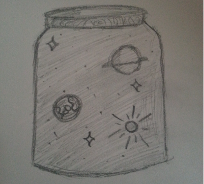
“Stars In A Bottle”
|
Genesis P.
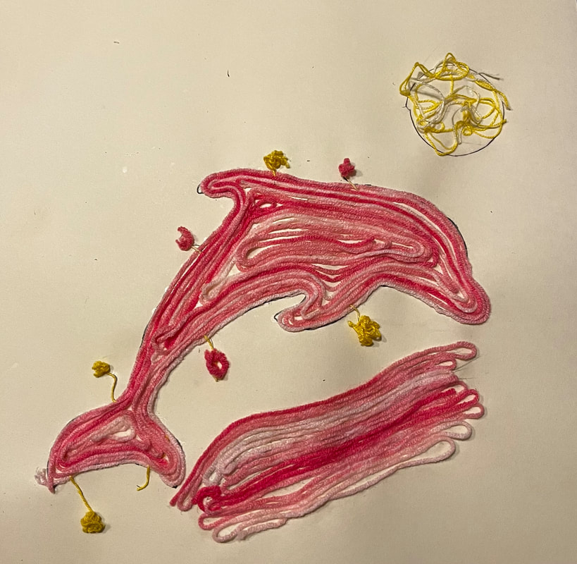
My symbol for this assignment is a dolphin, water, and flowers because my three words were smart, calm, and beautiful. Dolphins are very smart, the ocean is calm and beautiful and so are flowers. so I decided to have the dolphin surrounded with flowers because it makes it stand out and look more beautiful. I had the dolphin look like it's jumping out of the water. I added the sun to it because the sun makes you shine but it is not perfect because not everyone is. My symbol means to stand out and look beautiful.
|

This image is a project of of showing the negative and positive part of art. This art project showed that you could never stop adding detail, detail is important and that oil pastels are messy but fun. A Sunflower a symbol of loyalty, adoration, happy flower, and the perfect bloom for a summer flower delivery to brighten someone's mood! It is beautiful on its own and when its surround with a field of them.
|
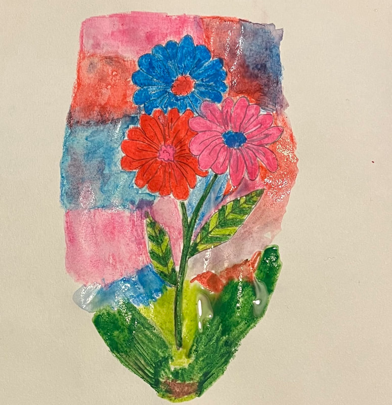
In this project it was a water colored pencils I decided to do cosmos flowers because there beautiful and all kinds of colors. In the background of this I tried to fill in the negative spaces with the colors of the flowers. I wanted it to look like a bricked pattern with the colors of the flowers to fill in the negative spaces.
|
Jett P.

For this piece of work I had mainly had wanted to just correlate the season at the time (Which was Fall), and then I just had a random thought to add hummingbirds, because of both of their abundant colors in nature. I used water color pencils and a thin-tipped black marker. I used the water colors and tried mixing them for the tree leaves as a "blurry" image and then colored the tree wood a brown and used the black marker to add a texture to it, so it showed sharper details. Then one of the birds I drew with sharper style of feathers and the other with less "sharper" details. Throughout drawing this I made the realization that not all things have sharp details, but that they all provide in a balance to make each other pop-out with colors.
|
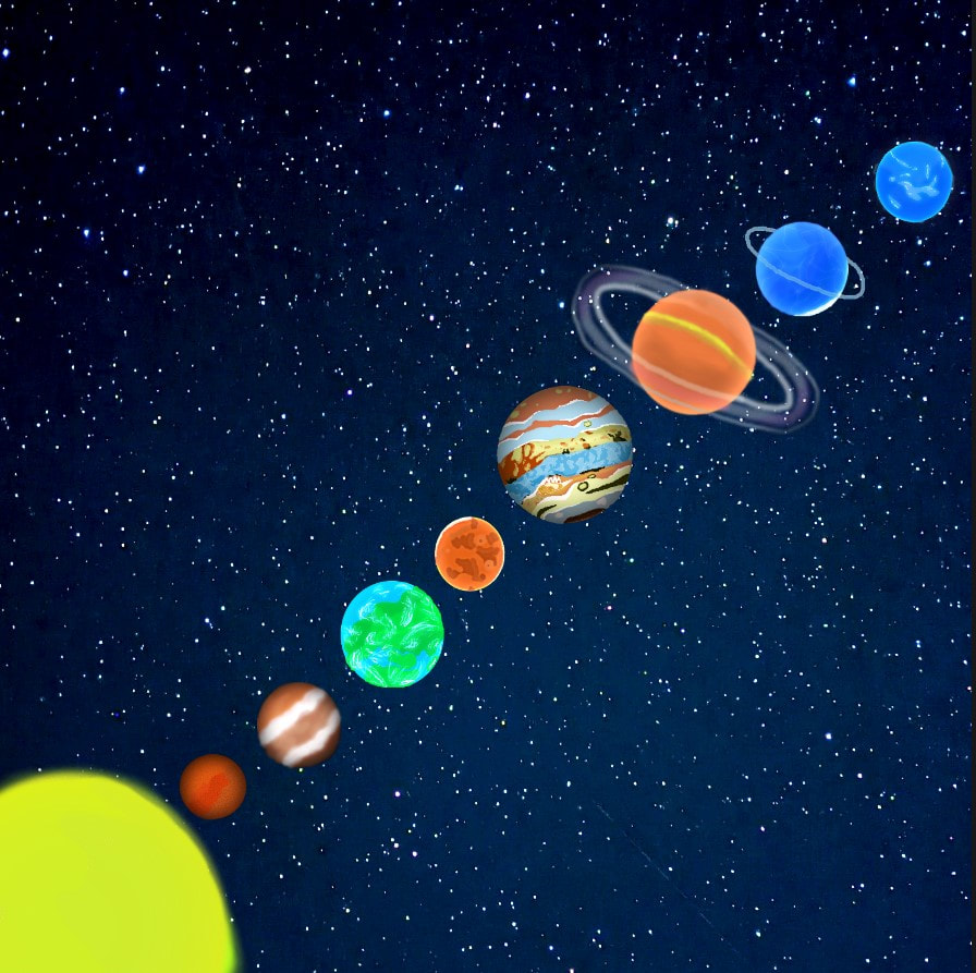
For my 2nd piece of work I tried focusing on adding as many details as I could to be as close to the real planets themselves. I used the online resource, Pixlr X to create it using an abundant amount of different tools. I don't really have a reason as to why I chose to do it as my topic, but it was a lot of fun learning how each of the tools worked and solving the problems I came across. Along with the little amount of time we had to work on it I feel good with how it came out in the end.
|

For my last piece of artwork, I chose to draw dinosaurs since I have a big passion for them and it's one of the most common topics I draw in art. I used a wooden stylus, paper, and scratch paper. I created drafts of the dinosaurs writing their names and how long they were around for on them as I drew. Before I was going to just to the scratch paper of them and then I had the idea to draw a background for them to fit them in. Overall using the scratch paper was fun and a new experience being able to only scratch once and not being able to erase or delete so you have to be careful what you do which is what made it a unique challenge.
|
Cameron P.

Perspective drawing
|

Drawing
|

Self-designed mousepad
|
Iris P.

Soulmates, having someone in your life is a really special thing, and it really sucks to loose them. In Greek tales, string can be used to symbolize life, and it's interesting it can also be used to symbolize soulmates.
|

Watermelon in the summer is the best feeling ever. Just last summer, I got a watermelon pool float that me and the neighbors played on every day in the pool. It only lasted a week before we inevitably popped it. The happiness of that summer was just so amazing and I hoped to capture that memory in my painting.
|

Chicken nuggets. For some people, they will never grow out of that childish phase where mac n cheese and chicken nuggets is the best food on the planet. I used a pop styled technique while painting what could be described as still life. This was so much fun and so silly to show everyone.
|
Maddie R.

This piece of art is a rough drawn Long Horn bull representing strength and independence.
|

This is a bull made of 2 sections created by nails and red and pink string.
|
This coral reef is showing lots of different vibrant colors which are in difference shapes and sizes.
|
Tristan S.

This a grid sketch done from an old assignment where we had to draw out a lily originally done by Georgia O'Keefe.
|

This is a baked clay coral reef with foil underneath for the base of the clay. The crab is main little character because it is small, easy to make, and a cute little addition to the reef.
|
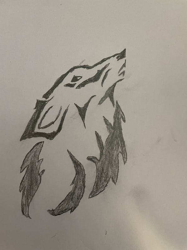
This is my favorite piece with an abstract wolf that represents me in being loyal, creative, and a wolf is my favorite animal.
|
Beckham S.
Probably the best perspective sketch I've done so far.
|

I came up with this for the start of an art project I did. I think it looks really aesthetically pleasing. I used positive a negative space to make it and I really like the shape of moons for some reason.
|
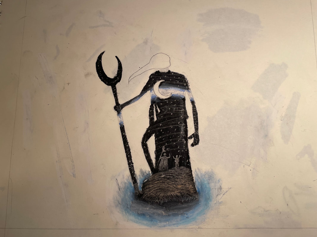
I drew a character from my favorite tv show. The character is the god of the moon and his name is Khonshu. He's an Egyptian god from the show Moon Knight.
|
Arcelia S.

Butterfly Drawing
|

Scratch Art
|

Clay Coral Reef
|
David S.

I really enjoyed making this one, and this is one of my favorite characters, he portrays perseverance, and endurance.
|

Someone actually asked or recommended to me to do this character. It's a character after he hit himself in the face with a frying pan. It's ridiculous and fun, and it's still one of my favorite drawings.
|

I did this for one of the art projects last semester. One of my best drawings. I largely followed a tutorial for Mysterio, but did some improvisation, making it my own, and then Deadpool in the helmet was my own entirely.
|
Calina T.

Clay Coral Reef
|

Origami Creatures
|

Painting
|
Neyla T.

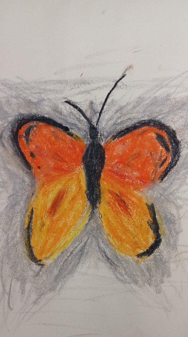
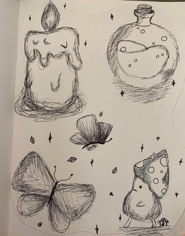
For this piece of art we had to use watercolor pencils so I decided to draw a butterfly with a rainbow background. I used a few different colors to make the butterfly stand out. I also tried to make the butterfly realistic to ones you would see in real life. I decided to draw butterflies because they are one of my favorite bugs and I think they are beautiful creatures. I had a lot of fun doing this project. It was one of my favorite pieces of art I did this year.
|
This piece of art was one of the first drawings I did in the beginning of the school year with the help of my art teacher. When I had to redo the first drawing I was thinking of what I wanted to draw and decided to do books because of my love for them. I did get help from my teacher because at the beginning of the year I was not very good at drawing and with her help I was able to draw two of my favorite books that I owned. I loved learning to draw better and to draw one of my favorite things. I tried to add as many details to the books as I could and make them look like the ones I own.
|

For this project we had to make a coral reef with some clay and we needed to add quite a few details to it. For this I tried to do quite a bit of brainstorming of how many details I could add to make this look really cool and detailed. I decided to add a crab and whale because there some of the more common sea creatures and I really liked how they both turned out. I also wanted to add coral, seaweed and a clam shell. I really liked adding the seaweed and clam. I think they added some detail and made it more realistic to an actual coral reef. I'm really happy with how this piece of art turned out. I found out I have a bit of a skill for sculpting and it was really fun to do because I love sea animals and the ocean.
|
Kylen V.
Yearbook Cover Drawing
|
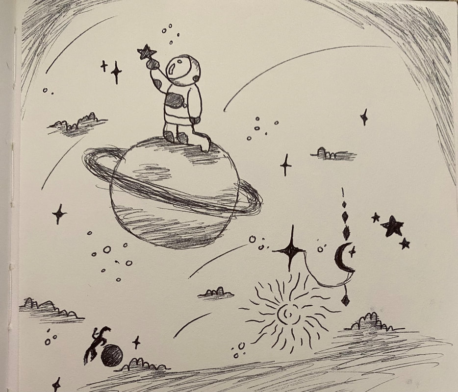
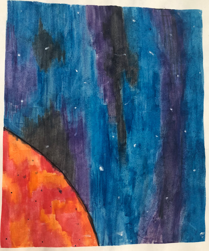
Space Drawing
|
Space Drawing
|
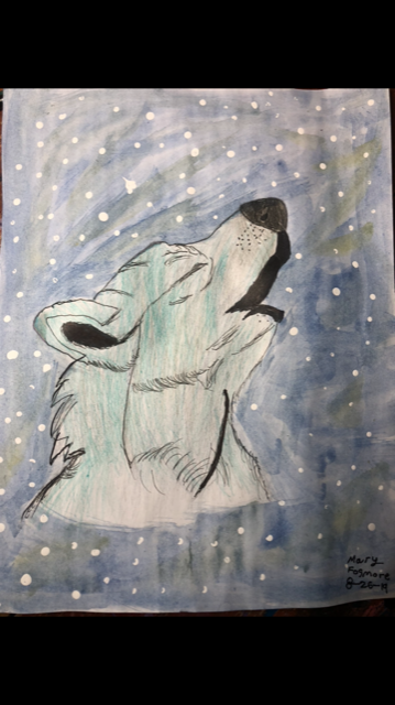
Mary F.
|
|

|
A Note to My Students
Throughout this school year the biggest key to our successful classroom has been you, the students! We have learned together, made mistakes, gotten lost, seen success, laughed, and cried. Art has been our class to express ourselves as we learned how to use new materials and find our individual artist voice. I am so proud of you, my students, this year! You have made our art class wonderful! I have loved seeing you brainstorm and guiding your efforts as you have created art that is personal and meaningful to you. Remember this year, and your experiences with art. Remember how to use art as a tool to help you find balance in life and expression. Remember that art is both a skill and a talent. Something to be achieved through hard work and lots of mistakes, and sometimes the process is more important than the result! I hope you will continue to share your art creations with me! I look forward to seeing any/all of you next year in our Intermediate Art Class! -Ms. McKnight